A website redesign for a new wave of users
About the project
Company
MOOV
Timeline
Oct - Dec 2022
My role
UX & UI design, UX research and handoff to development.
The challenges
Problem
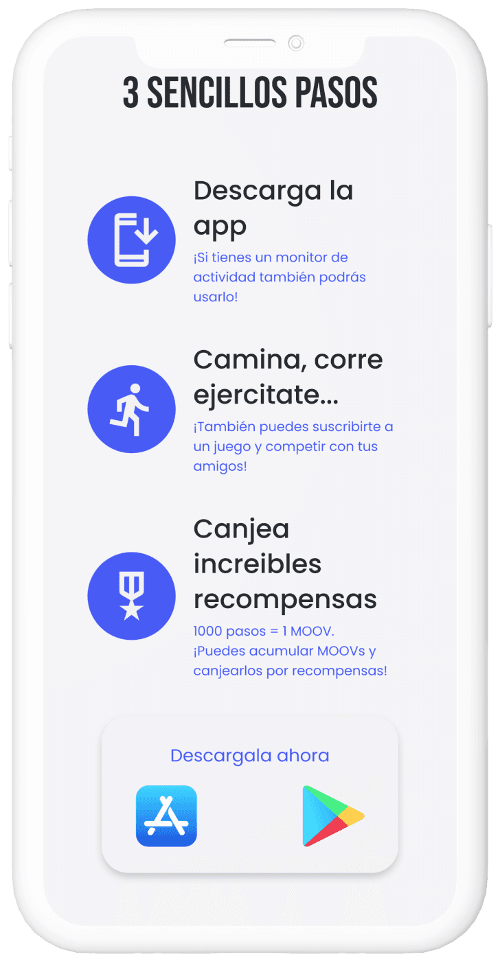
MOOV was transitioning to a second fase of the product, from web to a native app, the new website needs to be a place for new users to explore MOOV's value, answer common questions and ultimately lead them to download the new app.
Challenge 1
Design a user experience that inform users what MOOV is about and the platform change.
Challenge 2
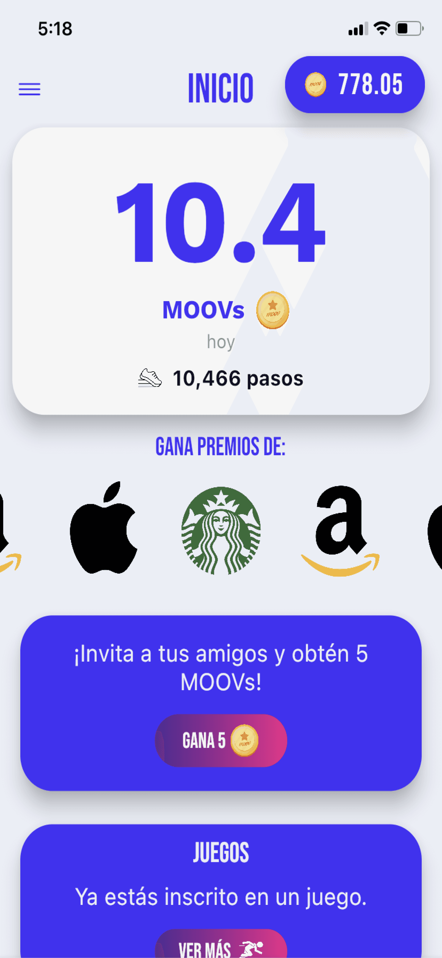
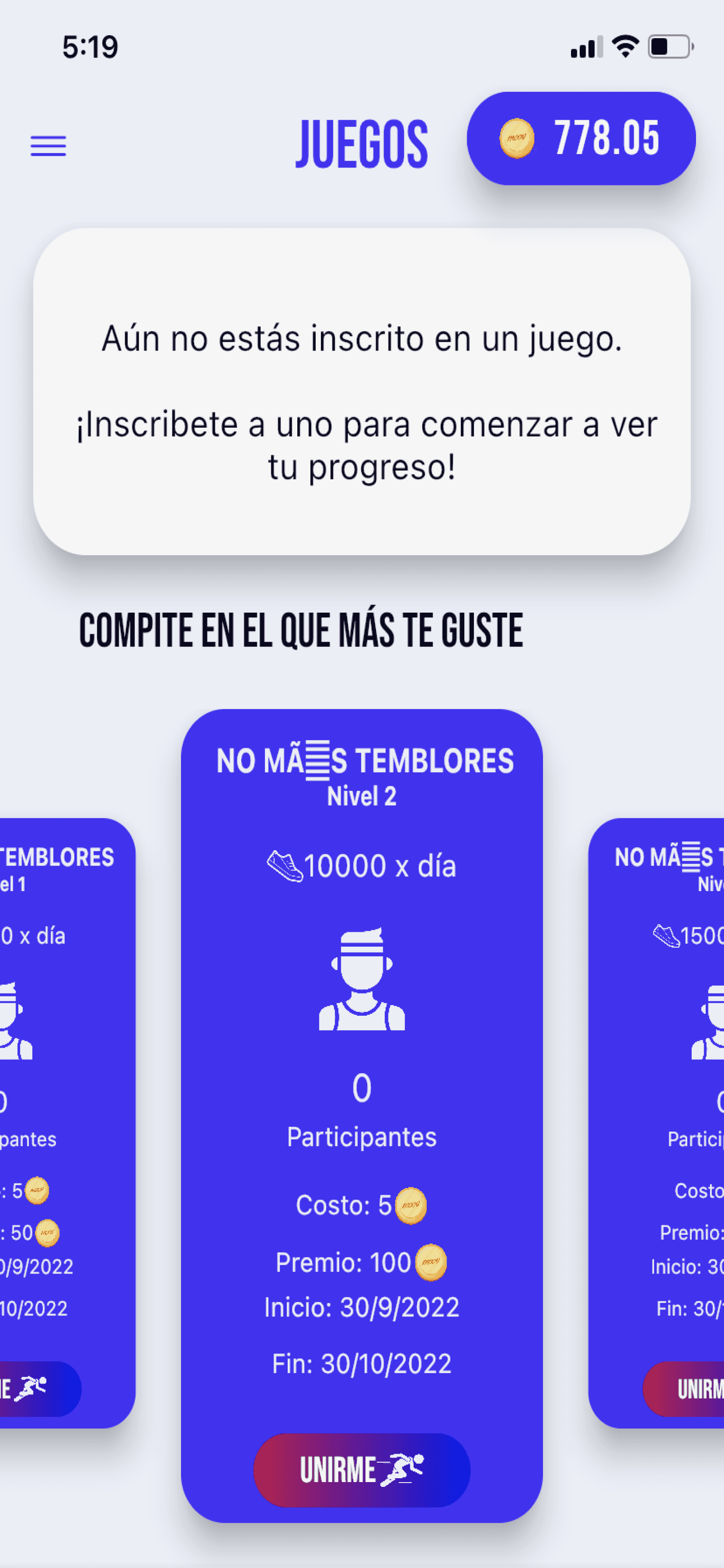
Take on from the current brand and app UI design, and create a unified product.
Challenge 3
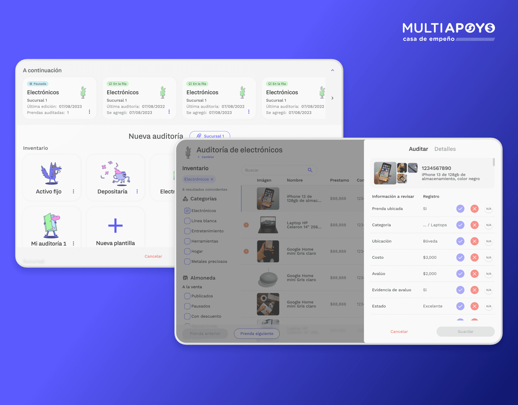
Introduce new Enterprise feature as a new product from MOOV.
The solution
Complete UX redesign
With updated information architecture. Tailored for existing and new users.
All new interaction design elements
Fresh UI elements that unifies both ends of the product, and provides a clear path to complete the task (download app).
The research
Competition
I looked into platforms with similar similar goals and products like:
Data analysis
Understanding of who the users are and how the product has evolved since launch.
User surveys
I did a surveys on 10 MOOV users from different ages, locations and lifestyles.
The insights
Where users come from
Most users come from recommendations from friends or a social media ad.
Big brand rewards
Users are mainly interested on the big brand rewards, that's what triggers the decision to download the app.
A lot of FAQs
There was a lot of information that users weren't aware of, it was not available to them.
Rewards first
Users are largely interested on the rewards more than any other value proposition from the product.
Information architecture
User flow
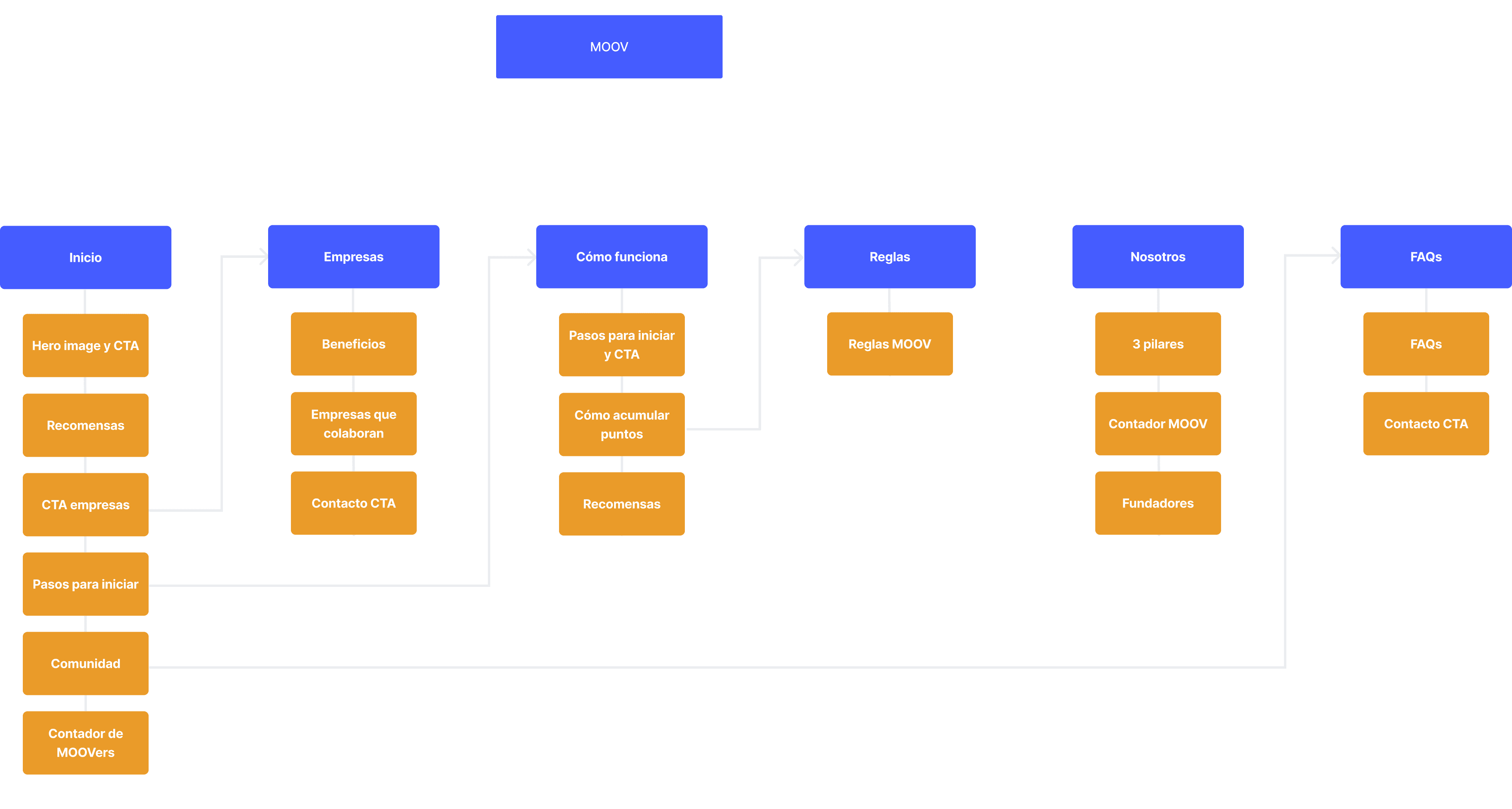
User gets to landing page from web ad or link.
User finds information that resolves FAQs.
User is directed to download the app.
User downloads app and creates account.
Sitemap
Click the image to open in full screen
The process
My process
An overlook of how my process looked like.
Identify
Test
Iterate
Design
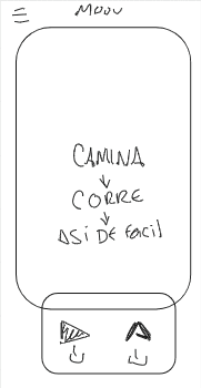
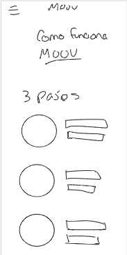
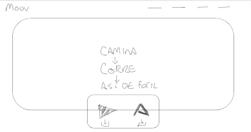
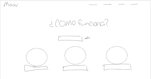
Ideation and conceptualization
My process started with lo-fi wireframes, I iterated several ideas until getting to the most efficient and funcional design.
The design
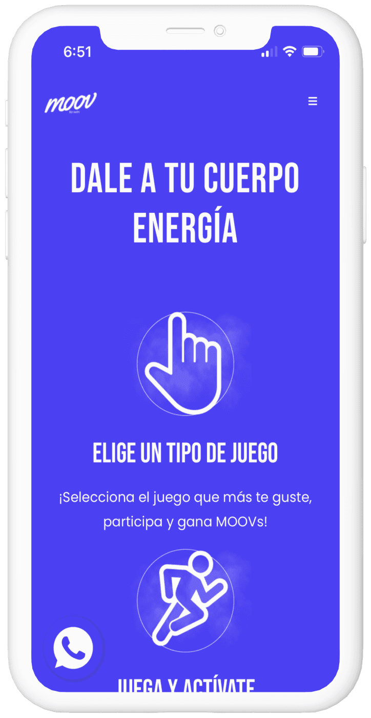
Interactive prototype
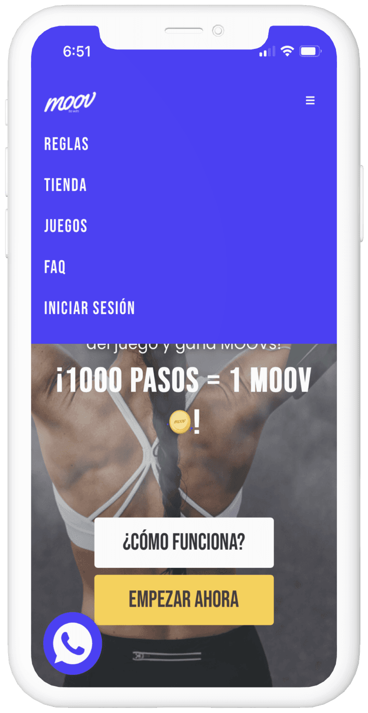
The interaction design
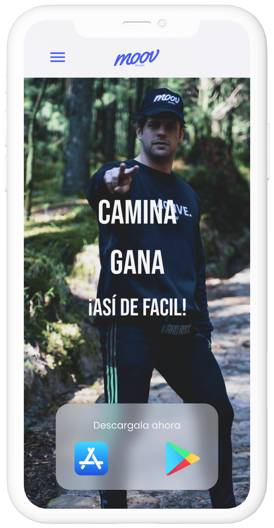
Hero section animation
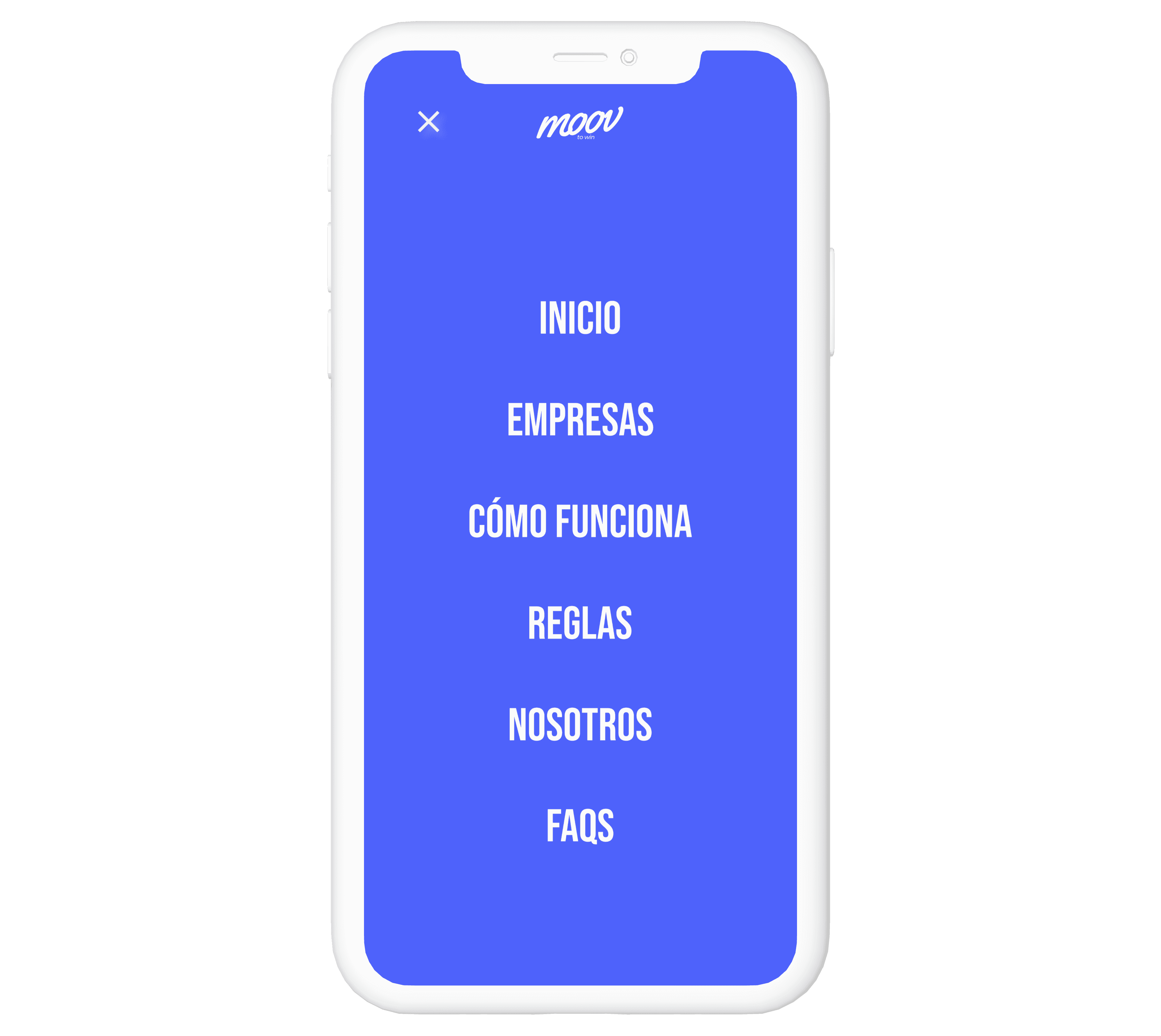
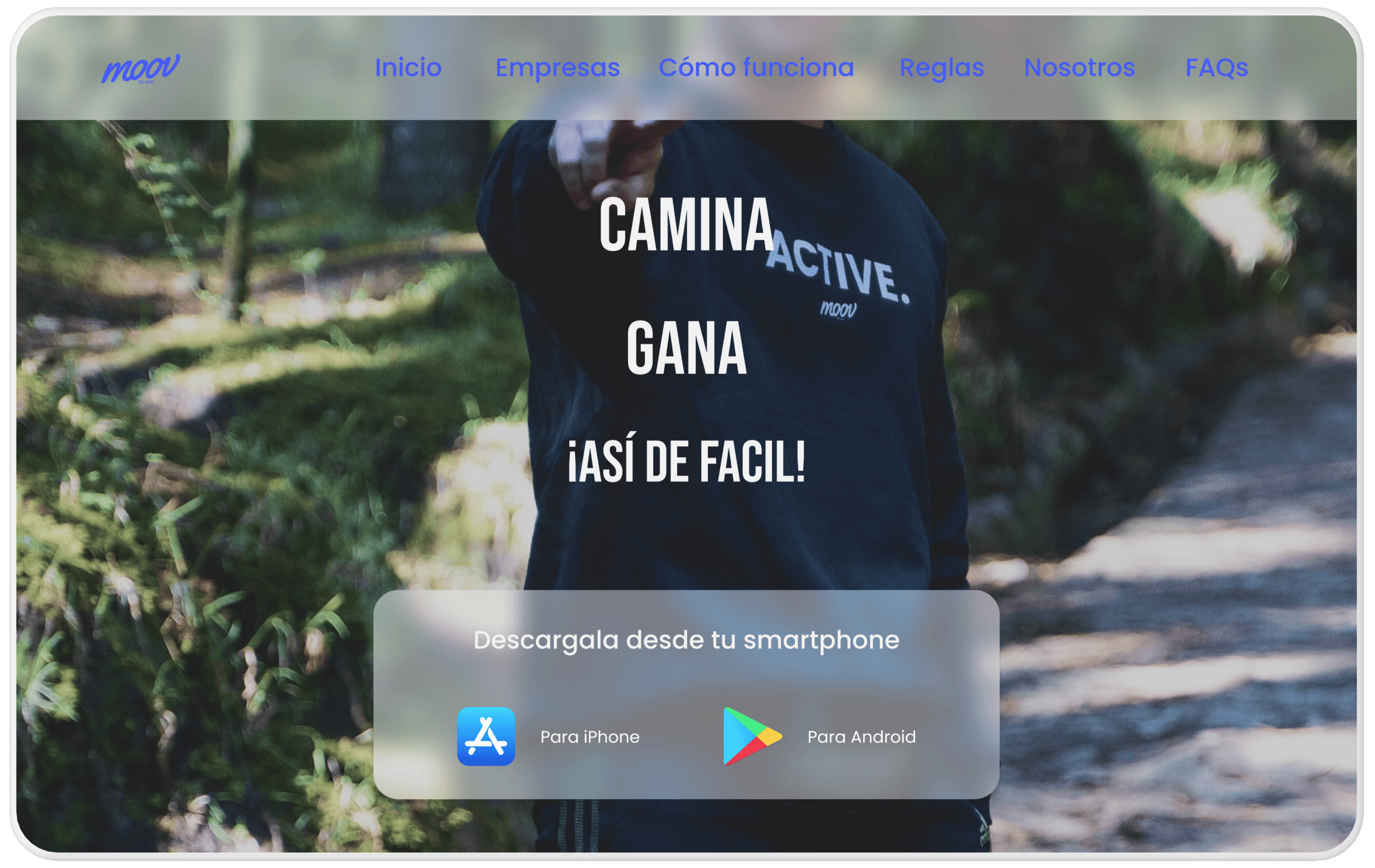
Navigation animations
Translucent materials
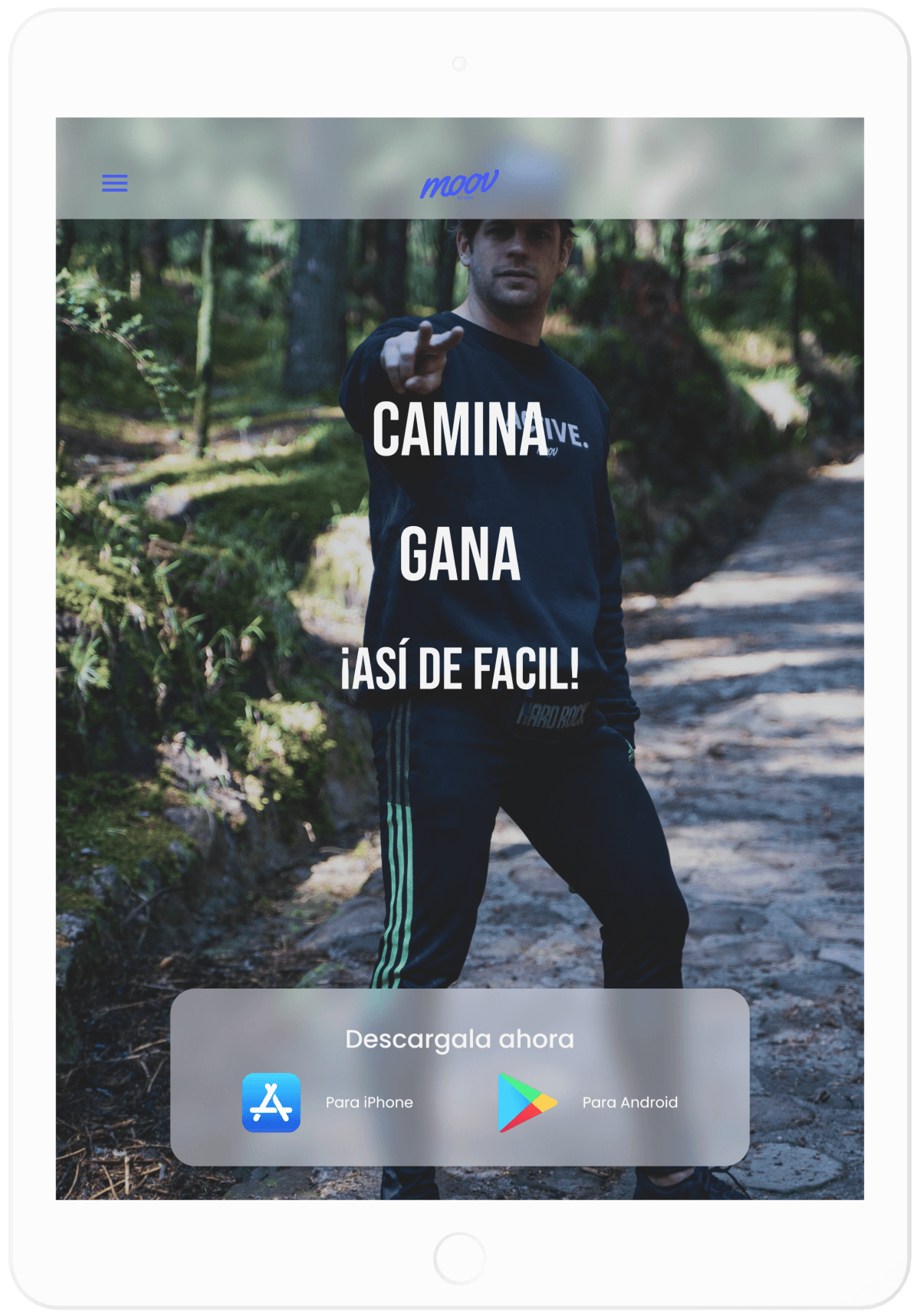
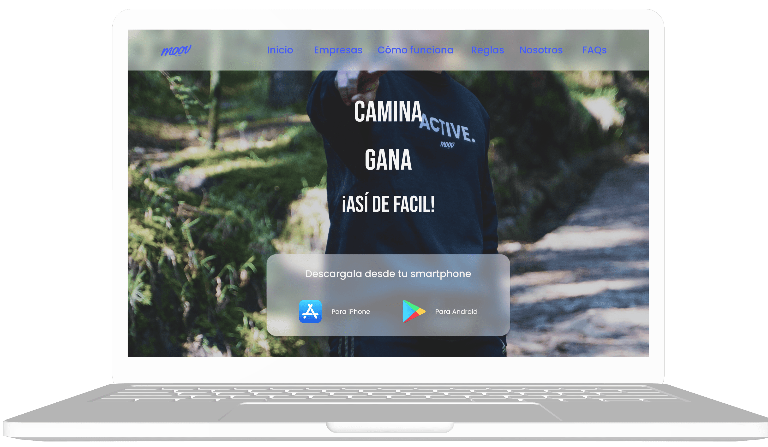
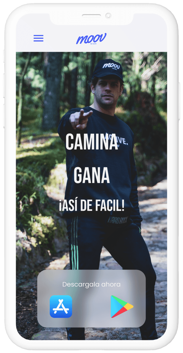
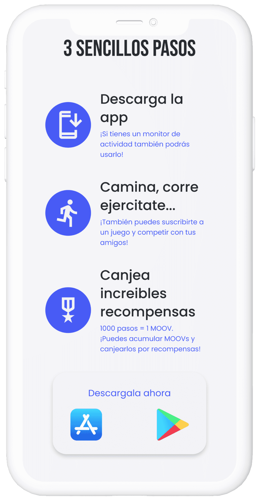
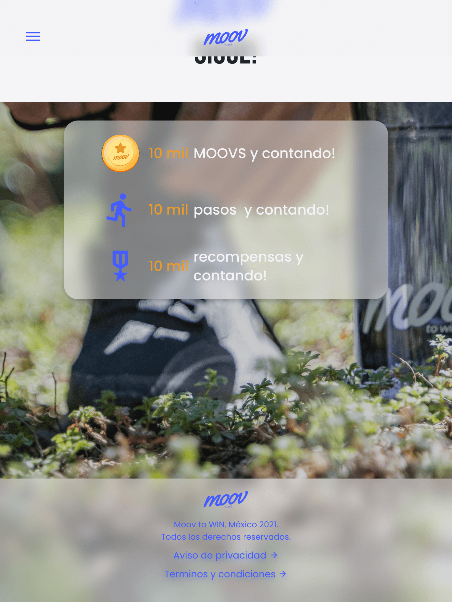
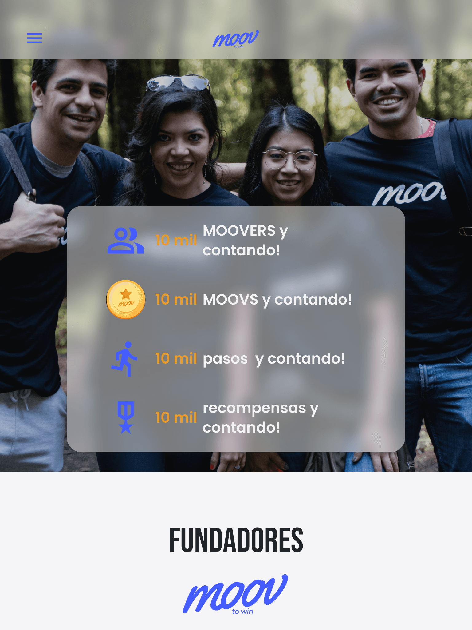
Before vs after
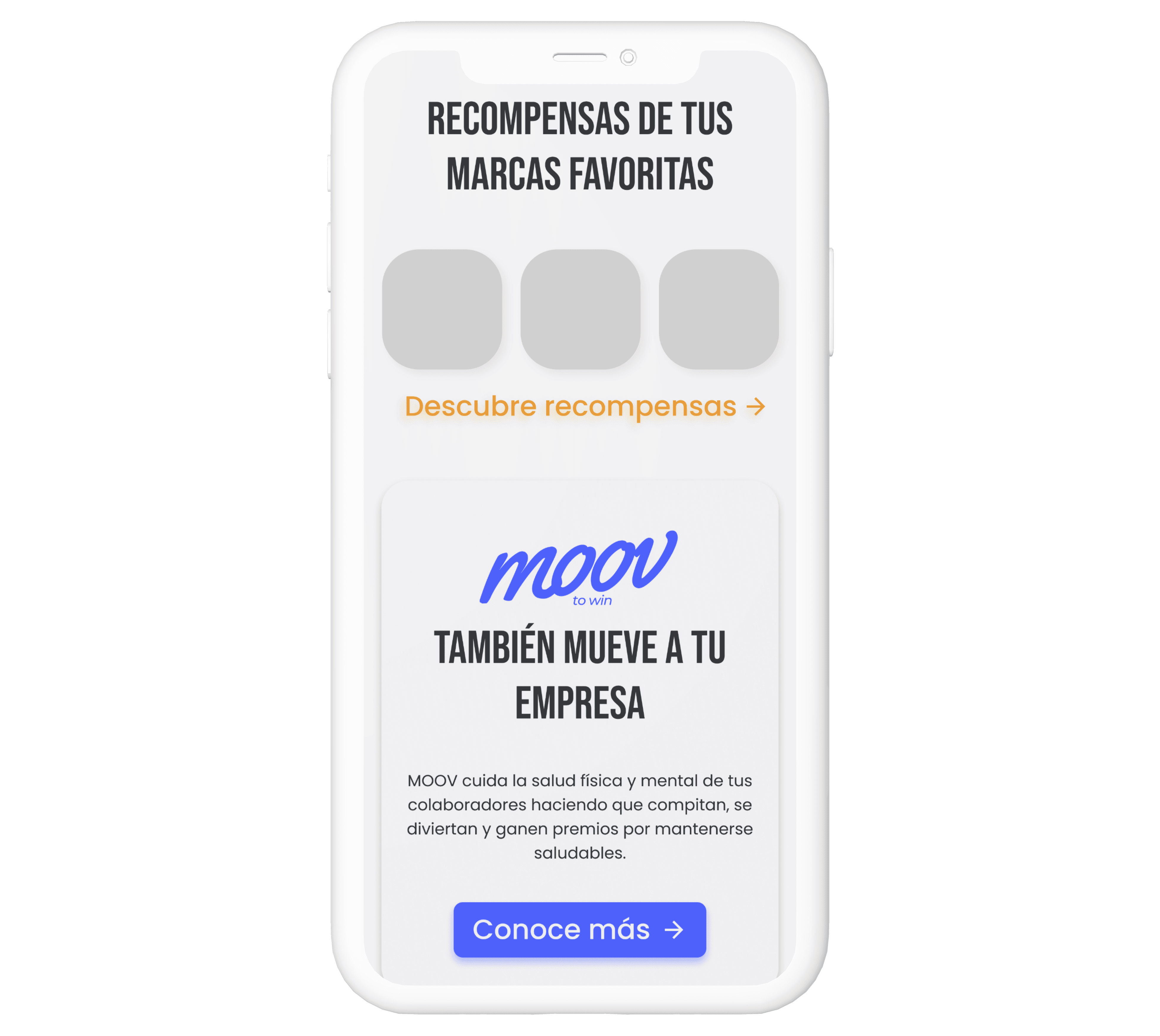
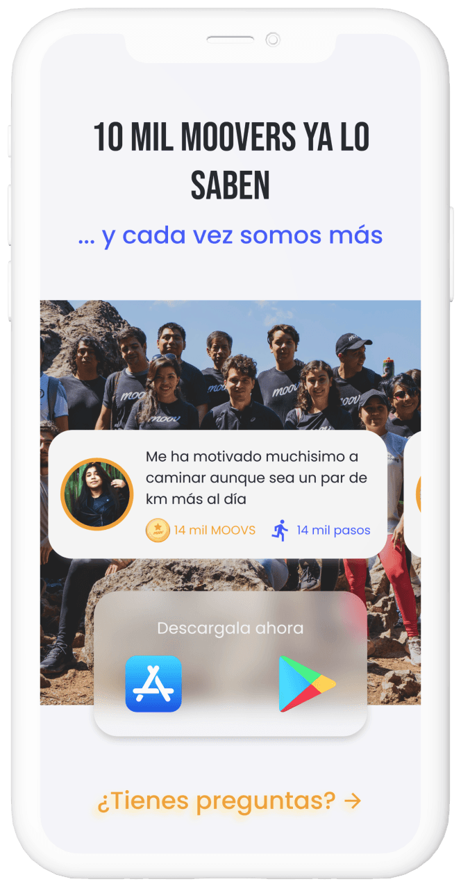
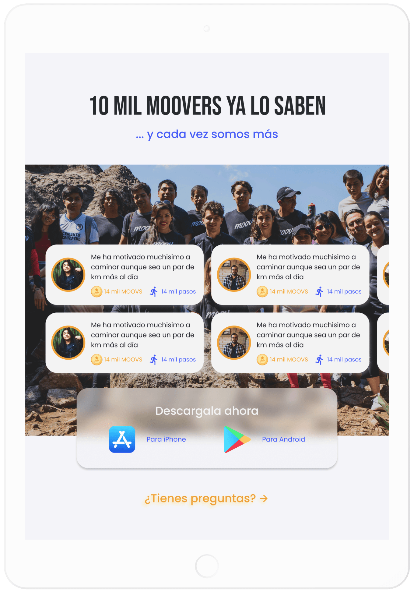
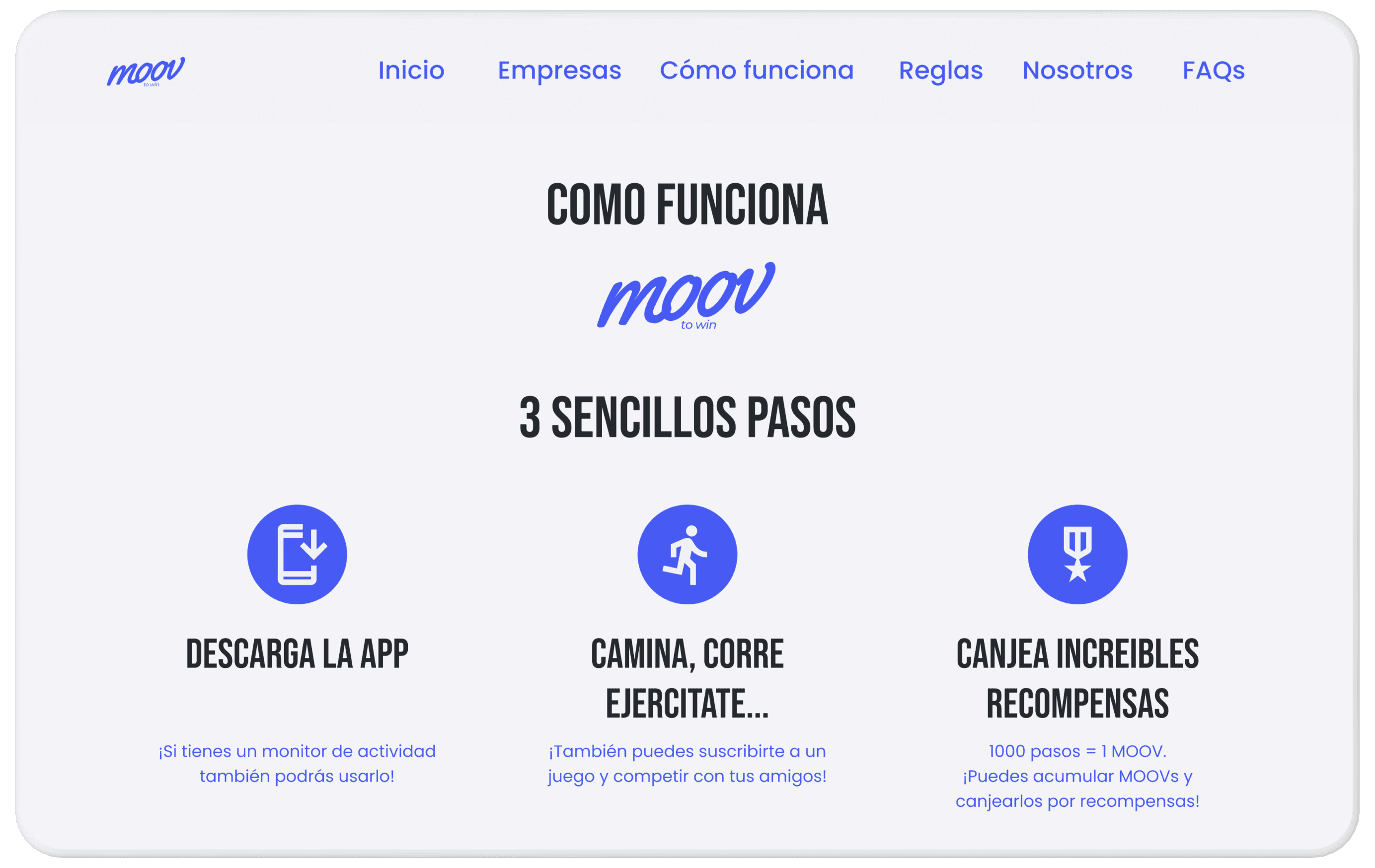
Original website
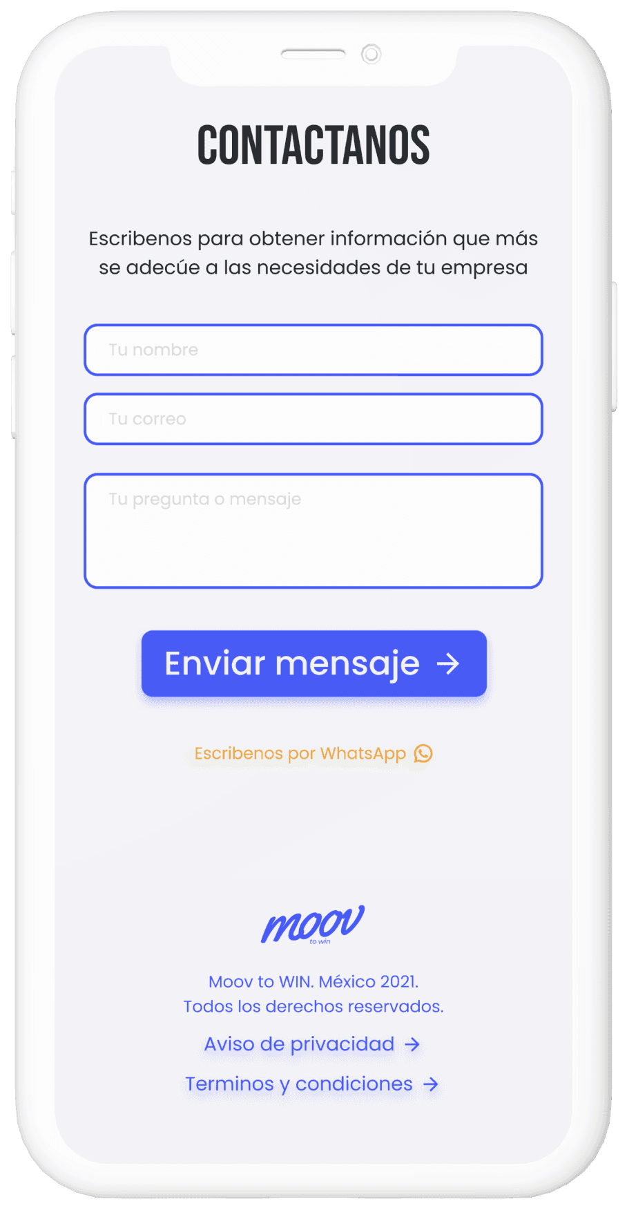
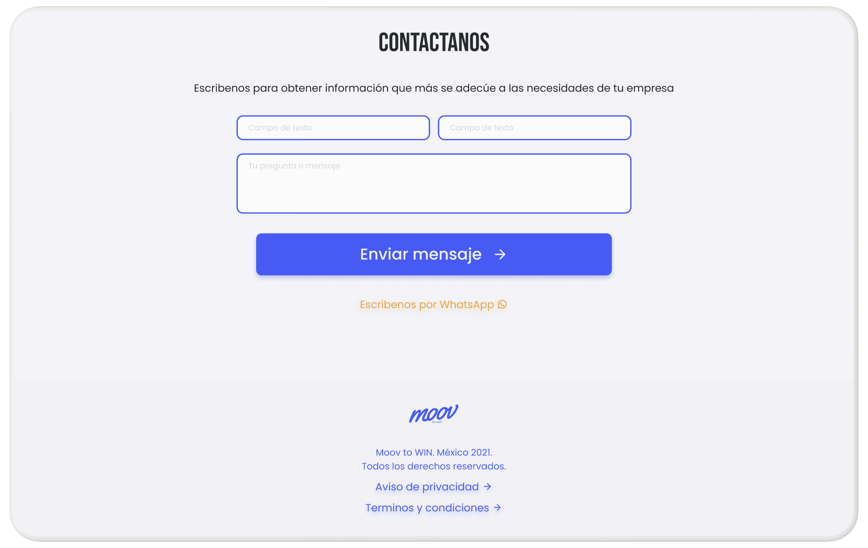
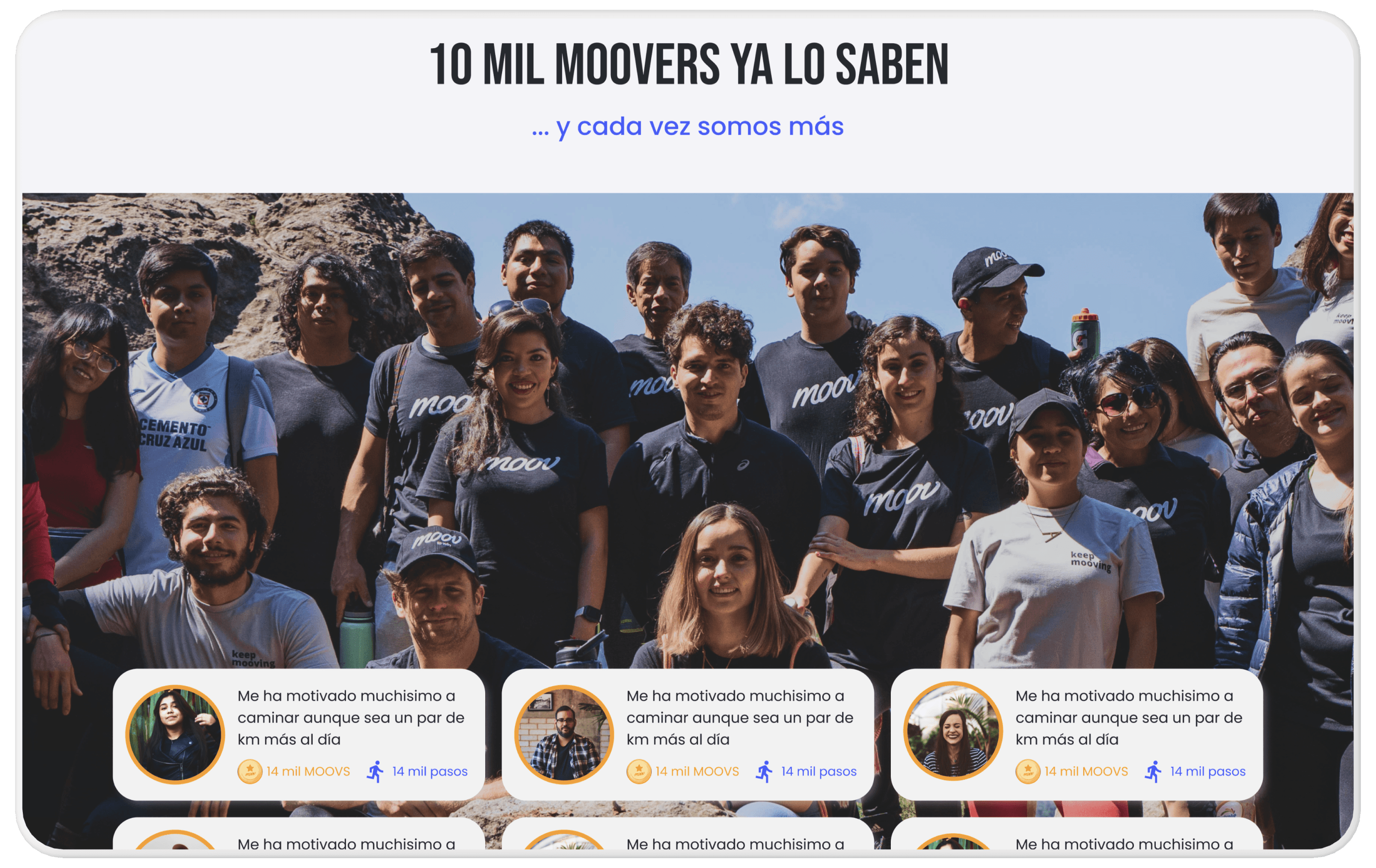
Redesign
The user testing and impact
User testing
1
I tested the prototype with users from 3 different ages.
2
I asked 3 users to complete 3 small tasks on the website, and at the end, I asked the users were would they find a specific piece of information, so they would navigate naturally.
Results
Better understanding
3 out of 3 users were able to complete the tasks provided and found the information asked for.
Too quick to click
On the first version of the product, the CTAs were fixed throughout the screen, this prompted users to click it way to soon without scanning the website first. I placed the CTAs in strategic places for the iterations.
Impact
Faster understanding of the product
The overall impact of the redesign was that the improved information architecture, which allowed the user to understand and find information faster.
New methodologies
I also was able to introduce the development team to agile sprints, and new software for the handoff. This allowed us to really accelerate the project.
My UX legacy
In the end, the company went for a different UI design because it aligned with the upcoming app redesign tasked to another design team.
But the company was very satisfied with my UX redesign so they applied the new design to my UX design, which I was glad it could be combined.
Key takeaways
The development team was not familiar with any agile methodologies, and the importance of mobile first design, which initially caused some minor delays.
I did short workshops to align the team, explain how would we be working and introduce the new software.
Conclusion
I was able to bring light to some of the misinterpreted user pain points and needs, which allowed me to create a much more streamlined product.
Because the UI was not used, some targets were missed only in minor ways.
What I would do differently
If I have known there were several UI options, I would have designed an UX that worked seamlessly with different UI.
I would've loved to work on the new app design first and then transition to the website, as that would have been a more natural step for a product of this nature.
Next steps
I would love to redesign app
The new website has been launched with the alternative UI, but I would love to approach the company in the future for a redesign of the app, to improve on those key user needs and pain points that were discovered during our collaboration.
