About the project
Company
Multiapoyo
Timeline
2022 - 2023
My role
UI, UX, interaction design, and testing
The goal
Overview
Streamline the user experience, ensure brand consistency, and accelerate development while maintaining a user-centered approach.
The GoldenWeb Design System, is a guide to creating consistent, user-centric, and straightforward experiences across the product.
At the core, this are our main goals:
Unify experience
Create a cohesive and consistent user experience across the entire product.
Consistency
Provide a set of standardized design components, patterns, and guidelines that ensure a cohesive and recognizable look and feel throughout our products.
Scalability
Design a system that can accommodate future growth and expansion while maintaining visual and functional harmony.
Collaboration
Facilitate collaboration between design, development, and other teams by establishing a shared design language.
Efficiency
Increase design and development efficiency and speed by providing a centralized resource for UI components, patterns, and guidelines.
Accesibility
Prioritize inclusive design principles to ensure the product is usable and enjoyable.
The requirements
Deliverables
1
Typography
2
Colors
3
Grids and layouts
4
Visual design
5
Iconography
6
Components
7
Interactions
Devices
Multiapoyo's Pawnshop OS is a web-based platform, so this design system is intended for desktop web usage, but considered to be used on a touch screen too.
The solution V1
This was the first version of the GoldenWeb Design system
Typography
We selected Work Sans because it works the best for web and it's available on Google fonts.
Work Sans
24px
Work Sans
24px
Work Sans
14px
Work Sans
14px
Work Sans
14px
Work Sans
14px
Work Sans
12px
Work Sans
12px
Work Sans
12px
Work Sans
12px
Work Sans
10px
Work Sans
10px
Colors
We selected a green color for the main one, because we carried it from the legacy of the existing software on the company.
green700
#35CF44
100%

green600
#35CF44
10%
yellow700
#FFBD00
yellow600
#FFF2CE
orange700
#5F2C14
orange600
#8E421E
carbon700
#414042
carbon600
#6D6E71
carbon500
#A7A9AC
carbon400
#CBCED1
carbon300
#E5E7E9
carbon200
#F3F3F3
white
#FFFFFF
Grids and layouts
The software is intended for low resolution desktop browser, so the main frame is 1280x832 and mobile is 360x800 because our target user uses mainly android phones with large screens.
Iconography
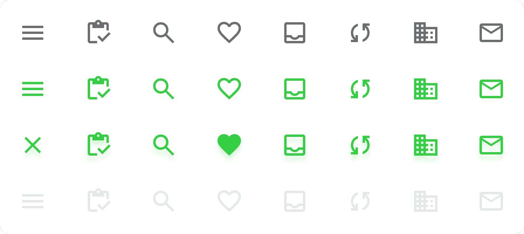
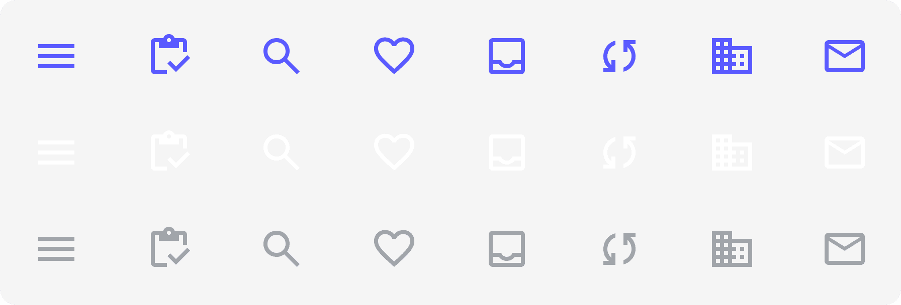
We selected the Material design symbols library from Google because it was more time efficient for the design team and development team at the time.
Components
The solution V2
After the MVP was released, management brought along a brand design team, so we had to adapt our Design system to accommodate the new brand design.
Typography
The rebranding of the product included a second typeface, which we used only for heading and subtitles.
32px
24px
24px
20px
Work Sans
16px
Work Sans
16px
Work Sans
12px
Work Sans
12px
Colors
The rebranding introduced a completely new color palette, much more vibrant, but we to adjusted it for accessibility.
Primario200
#5A5AFF
Primario100
#E5E5FF
Pink200
#FF6AE8
Pink100
#FFE5FB
Blue200
#30D8FF
Blue100
#D0F6FF
Red200
#FF6357
Red100
#FFBFBA
carbon700
#2A2C2F
carbon600
#54575C
carbon500
#71767D
carbon400
#E8E9EA
carbon300
#F4F5F5
carbon200
#FAFAFA
white
#FFFFFF
Grids and layouts
The software is intended for low resolution desktop browser, so the main frame is 1280x832 and mobile is 360x800 because our target user uses mainly android phones with large screens.
Iconography
We selected the Material design symbols library from Google because it was more time efficient for the design team and development team at the time.
Components
Interactions
Micro interactions
Visual design
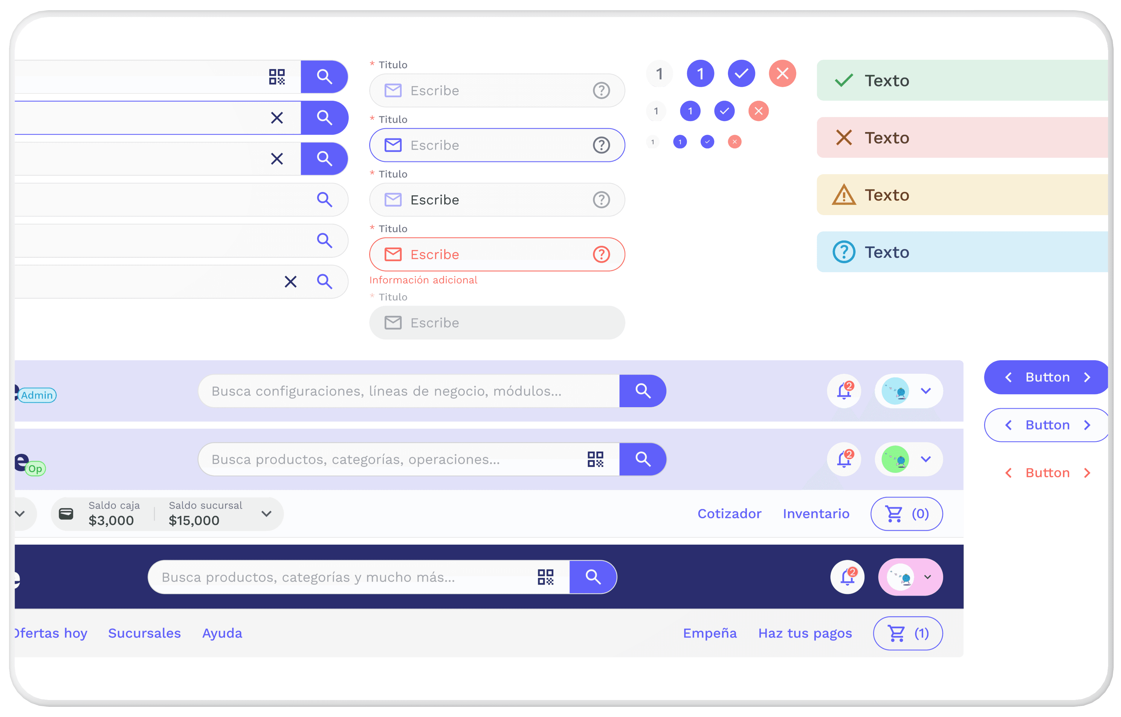
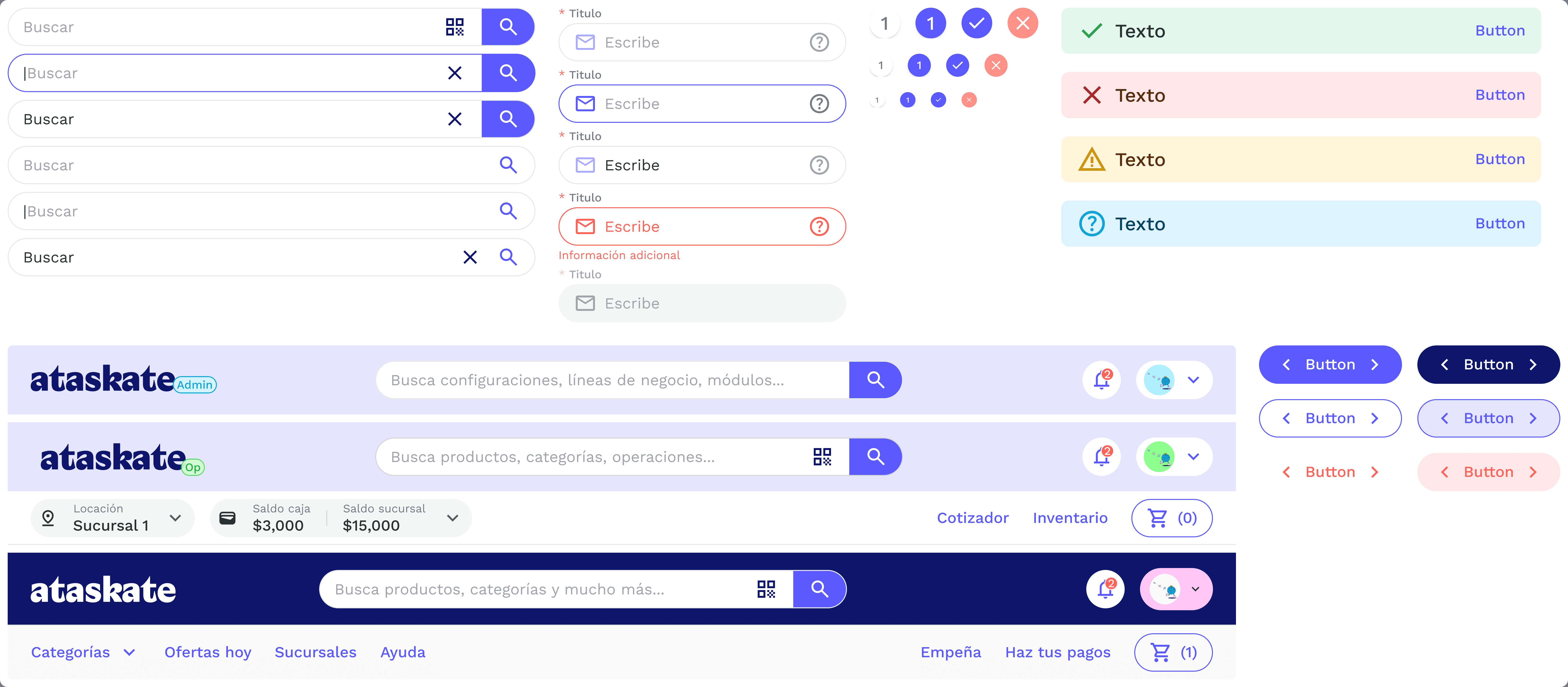
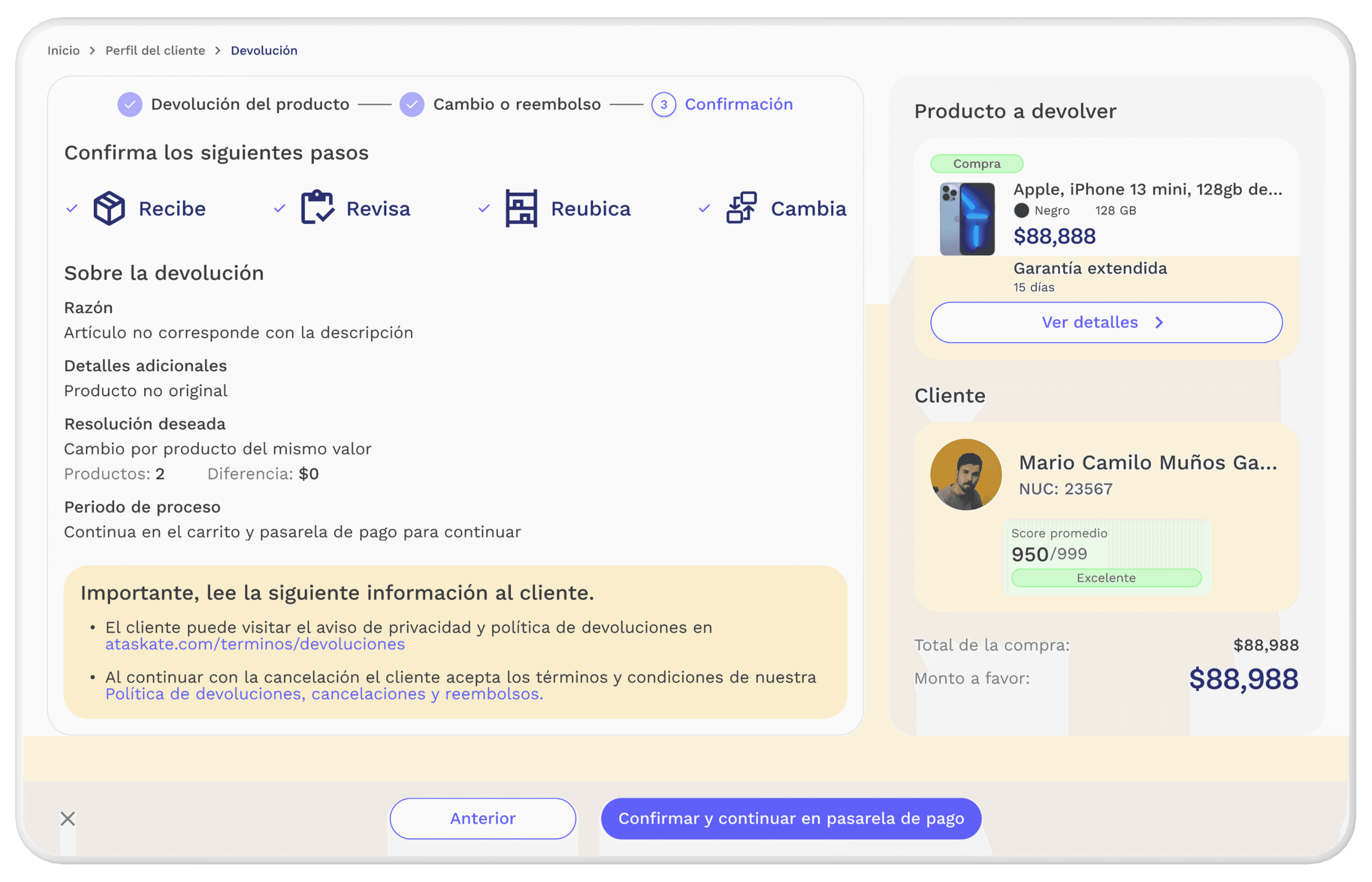
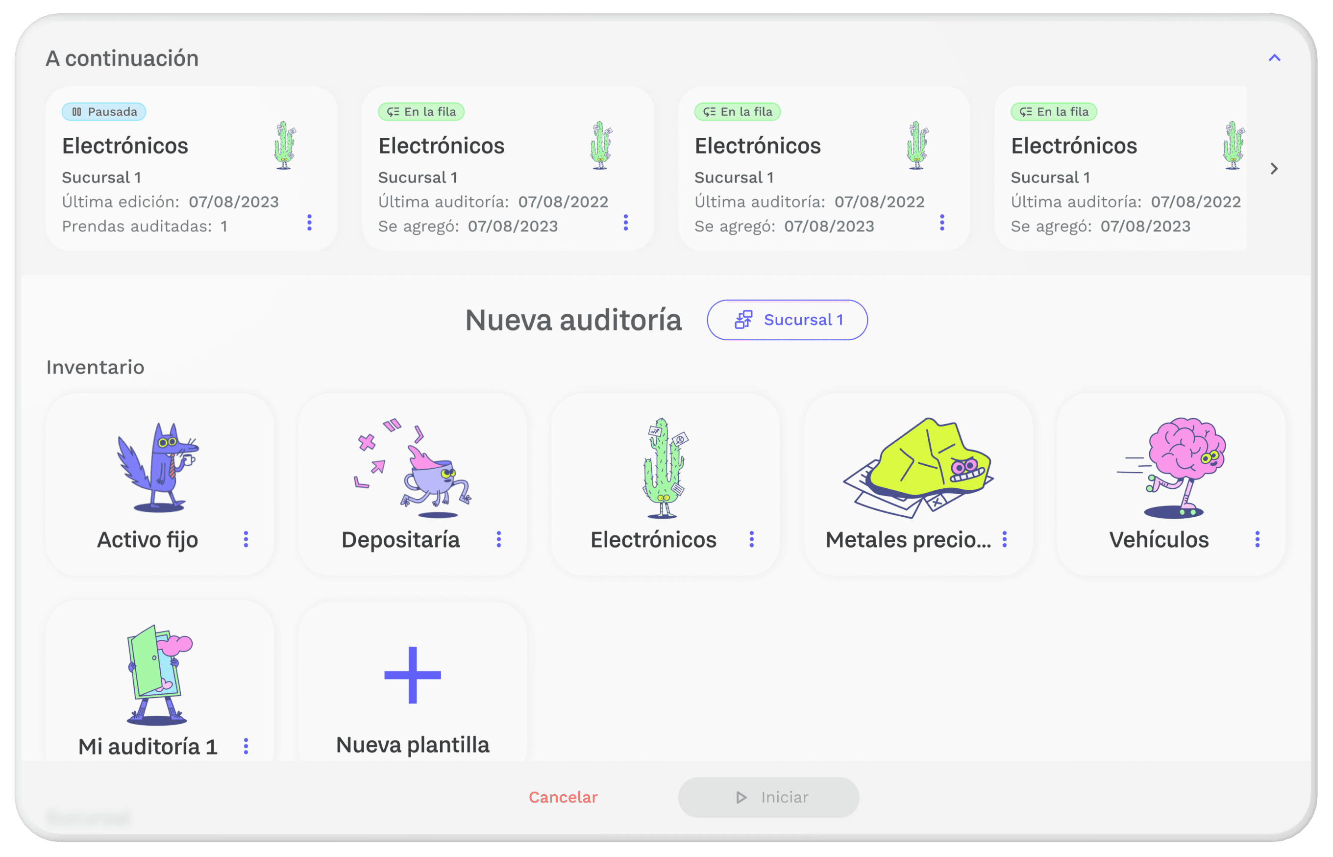
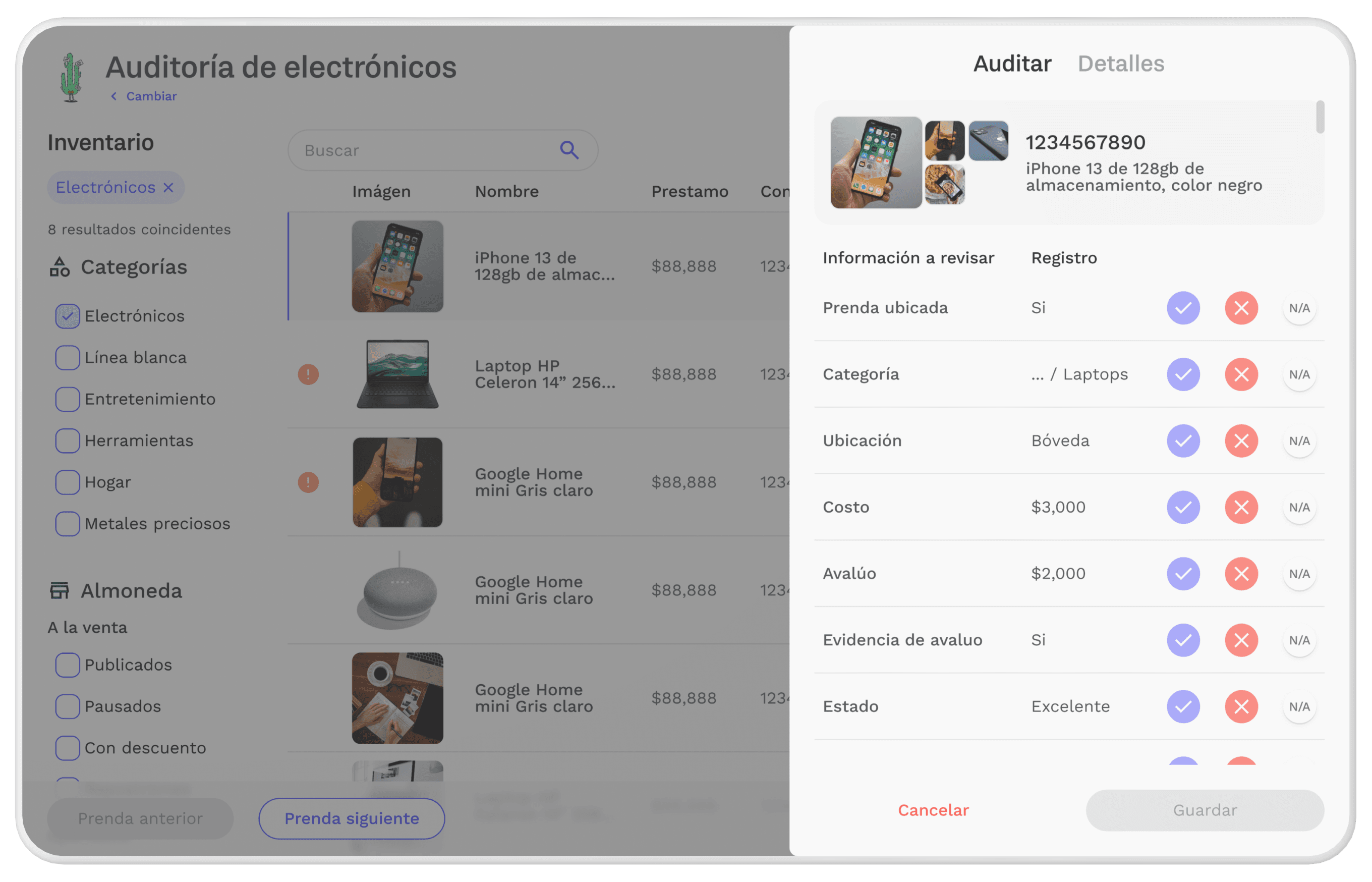
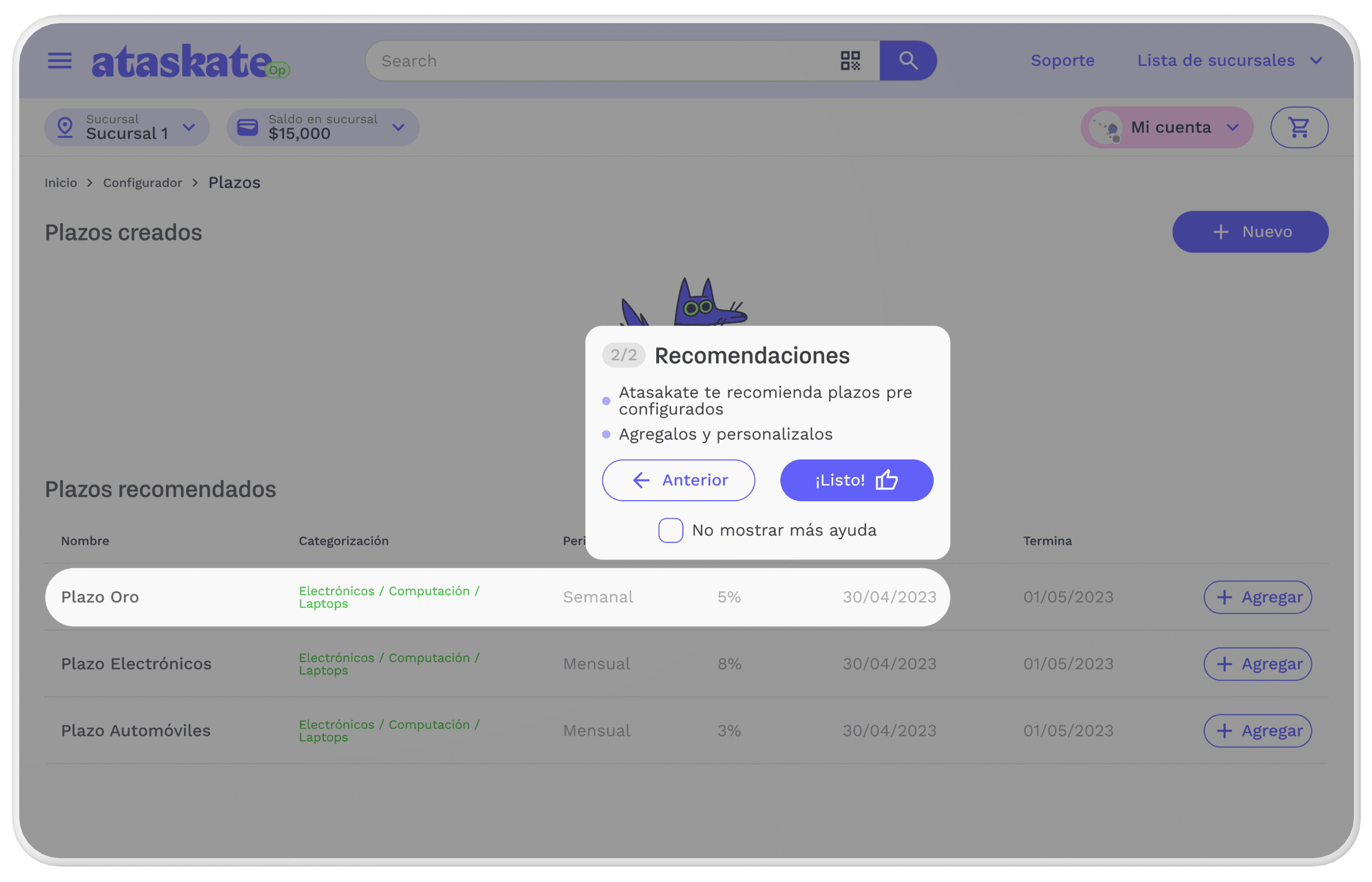
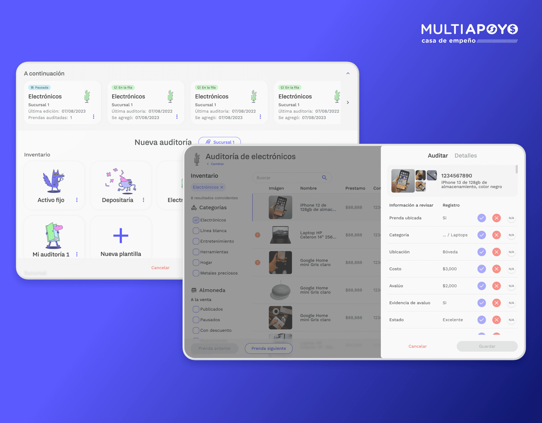
Some instances of the new and current design system in use
Atomic construction
Atoms
Tragic Grotesk
Work Sans
Work Sans
Work Sans
Molecules
Selecciona
Escribe
Button
Organisms
*
Titulo
Selecciona
*
Titulo
Escribe
Button
Templates
Titulo
Esta es una descripción
Subtitulo
*
Titulo
Selecciona
*
Titulo
Escribe
Subtitulo
*
Titulo
Escribe
Cancelar
Acción principal
The user testing and results
User testing
1
We tested the integration of the first version of the design system on the development of the MVP and created a repository of components.
2
We tested the accessibility of the typography, colors and icons.
3
We tested the interactions and micro interactions at the same time as we tested the design prototype.
Results
Development acceleration
According to management and front development leaders, the design system accelerated the creation of the MVP about 20%. And for the design team, we were able to ensure all the designs across the product were consistent and unified.
First version was too small
On the testing of the first version, users struggled to read some of the text, specially on descriptions.
We increased the size of the typographies across the board fot the second versión.
Key takeaways
After the MVP was released, management brought along a brand design team, so we had to adapt our Design system to accommodate the new brand design.
We planned ahead by creating a design system with powerful variants and properties that allowed us to change and redesign with ease.
What I would do differently
I would have ensured that the whole design team and future members were aligned on terms of how to document and create components, variants and properties.
I would have used a color palette that better suited web design and accessibility parameters, instead of aligning with the brand design that was intended for publicity.
